


Our IT and Allied Services are carefully curated to help brands attain a Digital Identity that customers and users are bound to love. Each of our services are curated by a team of industry's best resources to help deliver results beyond expectations.
CEO – Fuller BVBA
Belgium
CEO – WhartonApps
US
CEO – Crest White Strips
Australia
India Office
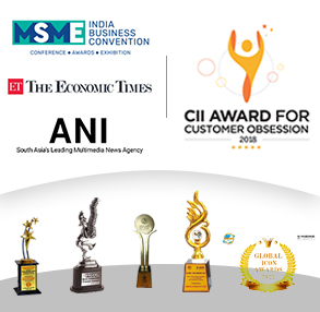
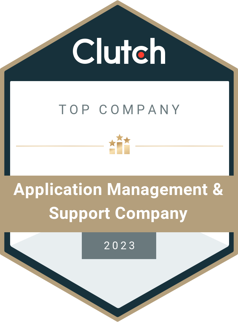
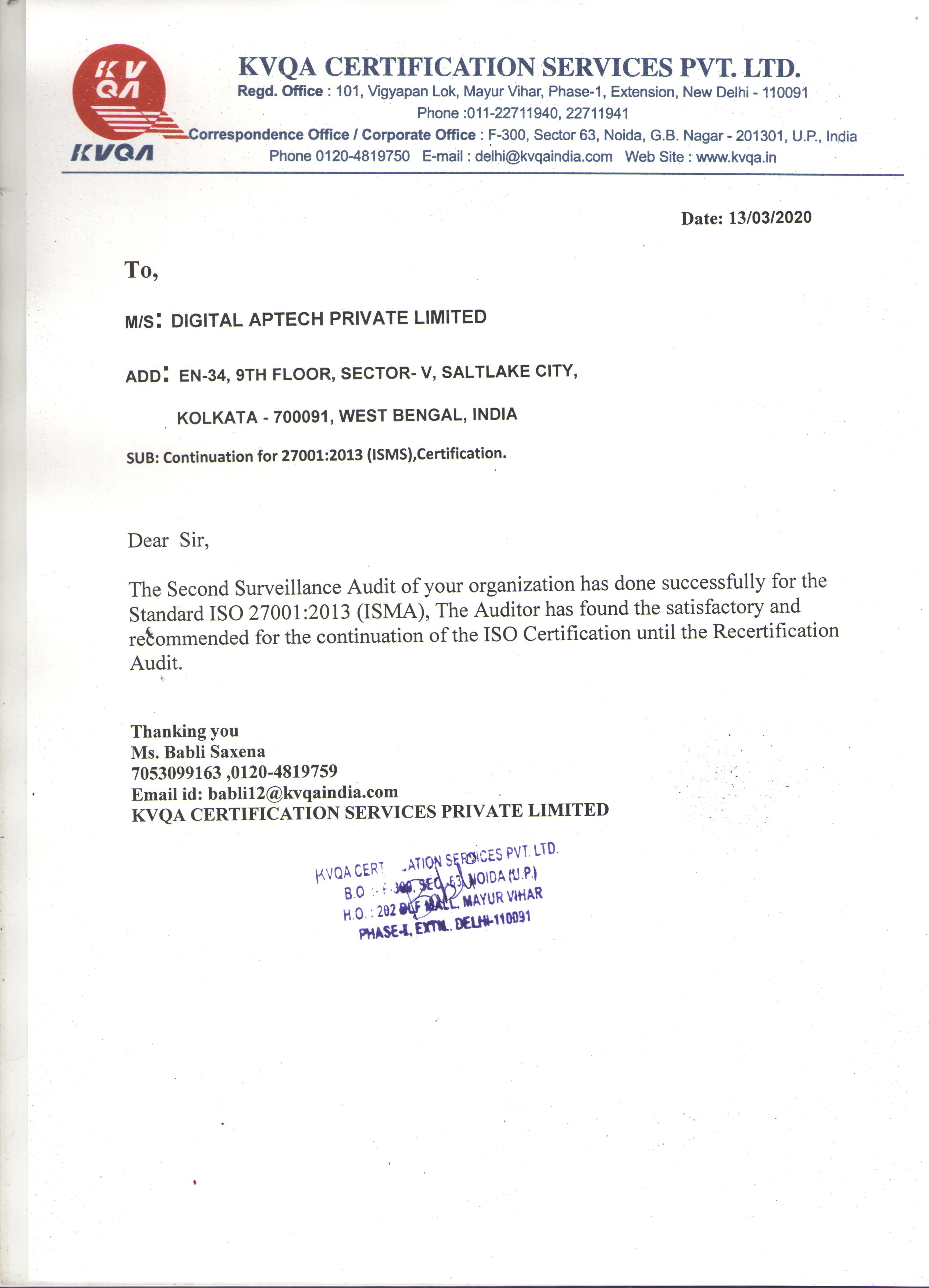
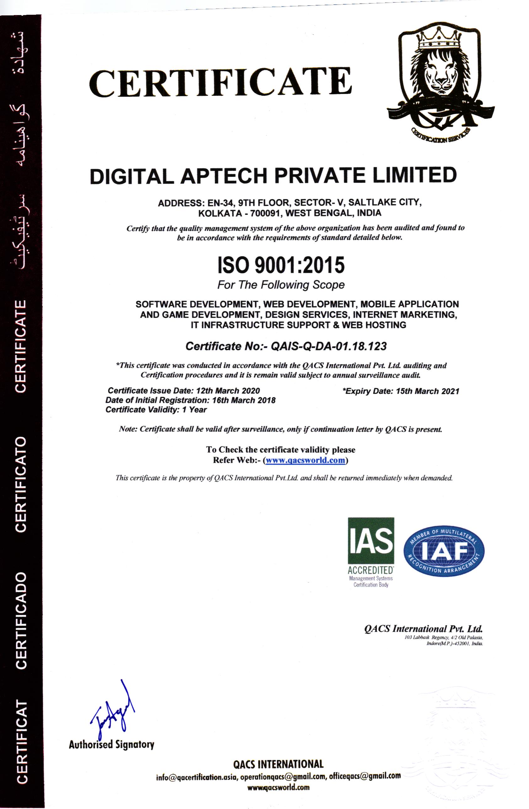
Digital Aptech is a CMMI Level-3 ISO-certified( ISO 9001, ISO 27001) IT support and services company with 10+ years of experience in offering cost-effective web and mobile app development, staff augmentation, data science, digital marketing, IT consulting and other services for SMEs, start-ups and emerging brands.
Digital Aptech has a decade-long experience in providing business IT solutions, and we have helped both established and budding brands reach new heights of success. Our focus on QUALITY, INFORMATION SECURITY and CUSTOMER CENTRICITY make us a preferred partner for collaboration among global brands.
When opting for an IT support and services provider, here are the pointers to keep in mind:
Digital Aptech has a long list of satisfied clients across multiple industry verticals. We have worked with brands from retail, healthcare, fashion, media, e-commerce, mining, telecommunications, IT, law and administration, transportation and more.
When you hire resources from Digital Aptech:
| 27001: 2013 Company | / | 9001: 2015 Company |
 +91 334 803 0879
 +44 122 739 0525
 +61 433 134 786
 +1 209 266 1340


